The ONS has just released its annual publication, The Effects of Taxes and Benefits on Household Income. The report gives data for the financial year 2012/13 and historical data from 1977 to 2012/13.
The publication looks at the distribution of income both before and after taxes and benefits. It divides the population into five and ten equal-sized groups by household income (quintiles and deciles) and shows the distribution of income between these groups. It also looks at distribution within specific categories of the population, such as non-retired and retired households and different types of household composition.
The data show that the richest fifth of households had an average pre-tax-and-benefit income of £81,284 in 2012/13, 14.7 times greater than average of £5536 for the poorest fifth. The richest tenth had an average pre-tax-and-benefit income of £104,940, 27.1 times greater than the average of £3875 for the poorest tenth.
 After the receipt of cash benefits, these gaps narrow to 6.6 and 11.0 times respectively. When the effect of direct taxes are included (giving ‘disposable income’), the gaps narrow further to 5.6 and 9.3 times respectively. However, when indirect taxes are also included, the gaps widen again to 6.9 and 13.6 times.
This shows that although direct taxes are progressive between bottom and top quintiles and deciles, indirect taxes are so regressive that the overall effect of taxes is regressive. In fact, the richest fifth paid 35.1% of their income in tax, whereas the poorest fifth paid 37.4%.
 Taking the period from 1977 to 2012/13, inequality of disposable income (i.e. income after direct taxes and cash benefits) increased from 1977 to 1988, especially during the second two Thatcher governments (1983 to 1990) (see chart opposite). But then in the first part of the 1990s inequality fell, only to rise again in the late 1990s and early 2000s. However, with the Labour government giving greater cash benefits for the poor, inequality reduced once more, only to widen again in the boom running up to the banking crisis of 2007/8. But then, with recession taking hold, the incomes of many top earners fell and automatic stabilisers helped protect the incomes of the poor. Inequality consequently fell. But with the capping of benefit increases and a rise in incomes of many top earners as the economy recovers, so inequality is beginning to rise once more – in 2012/13, the Gini coefficient rose to 0.332 from 0.323 the previous year.
As far as income after cash benefits and both direct and indirect taxes is concerned, the average income of the richest quintile relative to that of the poorest quintile rose from 7.2 in 2002/3 to 7.6 in 2007/8 and then fell to 6.9 in 2012/13.
Other headlines in the report include:
Since the start of the economic downturn in 2007/08, the average disposable income has decreased for the richest fifth of households but increased for the poorest fifth.
Cash benefits made up over half (56.4%) of the gross income of the poorest fifth of households, compared with 3.2% of the richest fifth, in 2012/13.
The average disposable income in 2012/13 was unchanged from 2011/12, but it remains lower than at the start of the economic downturn, with equivalised disposable income falling by £1200 since 2007/08 in real terms. The fall in income has been largest for the richest fifth of households (5.2%). In contrast, after accounting for inflation and household composition, the average income for the poorest fifth has grown over this period (3.5%).
This is clearly a mixed picture in terms of whether the UK is becoming more or less equal. Politicians will, no doubt, ‘cherry pick’ the data that suit their political position. In general, the government will present a good news story and the opposition a bad news one. As economists, it is hoped that you can take a dispassionate look at the data and attempt to relate the figures to policies and events.
Report
The Effects of Taxes and Benefits on Household Income, 2012/13 ONS (26/6/14)
Data
Reference tables in The Effects of Taxes and Benefits on Household Income, 2012/13 ONS (26/6/14)
The Effects of Taxes and Benefits on Household Income, Historical Data, 1977-2012/13 ONS (26/6/14)
Rates of Income Tax: 1990-91 to 2014-15 HMRC
Articles
Inequality is on the up again – Osborne’s boast is over New Statesman, George Eaton (26/6/14)
Disposable incomes rise for richest fifth households only Money.com, Lucinda Beeman (26/6/14)
Half of families receive more from the state than they pay in taxes but income equality widens as rich get richer Mail Online, Matt Chorley (26/6/14)
Rich getting richer as everyone else is getting poorer, Government’s own figures reveal Mirror, Mark Ellis (26/6/14)
The Richest Households Got Richer Last Year, While Everyone Else Got Poorer The Economic Voice (27/6/14)
Questions
- Define the following terms: original income, gross income, disposable income, post-tax income, final income.
- How does the receipt of benefits in kind vary across the quintile groups? Explain.
- What are meant by the Lorenz curve and the Gini coefficient and how is the Gini coefficient measured? Is it a good way of measuring inequality?
- Paint a picture of how income distribution has changed over the past 35 years.
- Can changes in tax be a means of helping the poorest in society?
- What types of income tax cuts are progressive and what are regressive?
- Why are taxes in the UK regressive?
- Why has the fall in income been largest for the richest fifth of households since 2007/8? Does this mean that, as the economy recovers, the richest fifth of households are likely to experience the fastest increase in disposable incomes?
 On my commute to work on the 6th May, I happened to listen to a programme on BBC radio 4, which provided some fascinating discussion on a variety of economic issues. Technological change is constant and unstoppable and the consequences of it are likely to be both good and bad.
In this programme some top economists, including Joseph Stiglitz offer their analysis of the impact of technology and how the future might look, by considering a range of factors, such as youth unemployment, the productivity of labour, education, pensions and inequality. The benefits of new technology can be seen as endless, but the impact on inequality and how the benefits of technology are being distributed is a concern for many people. The best introduction to the programme and its content is simply to reproduce the description provided by BBC radio 4.
The baby boom generation came of age when it was accepted knowledge that innovation and productivity would always lead to higher standards of living. The generations which followed assumed this truth would continue into the future indefinitely. With the crash of 2008 the upward mobility the middle classes assumed was their right evaporated, and it is unlikely to return.
Martin Wolf, chief economics commentator of the Financial Times, asks how the work force of the future will be changed by the advancements of technologies. How should governments respond to a jobs market which is hollowing out opportunities for traditional educated professions and how will rewards for innovation and income for labour be distributed without creating a society plagued by endemic inequality?
We will speak with optimists and pessimists on both sides of the argument to find out how the repercussions of these changes will affect the way we all live now and well into the future.
It is well worth listening to and provides some interesting insights as to what the future might look like, as the inevitable technological change continues. The link for the programme is below.
 The future is not what it used to be BBC Radio 4 (6/5/14)
Questions
- What are the expected costs and benefits of technological change?
- Which factors are discussed as being the main obstacles to upwards mobility? Why have these become more prevalent in recent decades?
- Using a diagram, explain how technology can improve economic growth. To what extent is the multiplier effect important here?
- How is technology expected to affect the labour market? Use a diagram to help your explanation and make sure you consider both sides of the argument.
- What is meant by the idea that the benefits of new technology are likely to be felt in the long run?
- How important is education in creating equal opportunities?
- What is meant by secular stagnation? Is it seen as being a problem?
 Life expectancy is increasing across the world and the latest set of figures from the Office for National Statistics show that in the UK it has passed 79 for boys born in 2010–12, and 82 for girls born then. In fact the prediction is that over a third of babies born in 2013 will live to more than 100. The data throws up some interesting questions. How well prepared are we for lives that last this long? And how evenly distributed is this increase in life expectancy? Pensions’ minister, Steve Webb, has called for better information on life expectancy to be shared. How would this impact on our decision making?
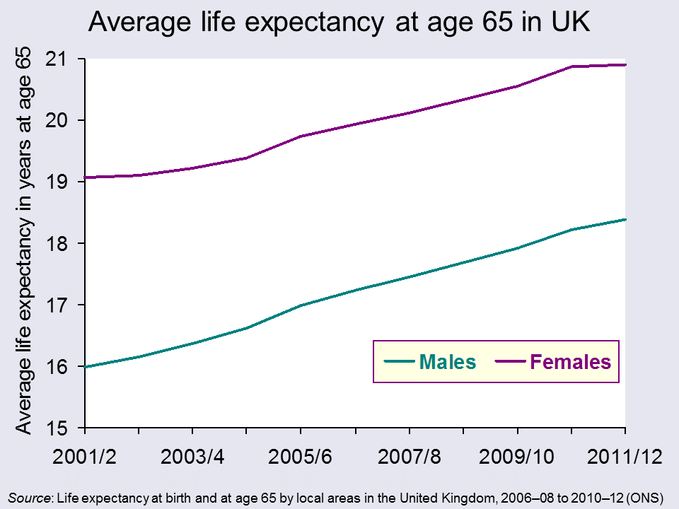
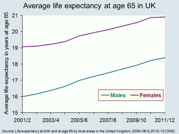
It seems reasonable to think that increasing life expectancy must be good news. And of course, for individuals it can be. In 1951 the average man retiring at 65, in England and Wales, could expect to live and draw a pension for another 12.1 years. By 2014 this had risen to 22 years.
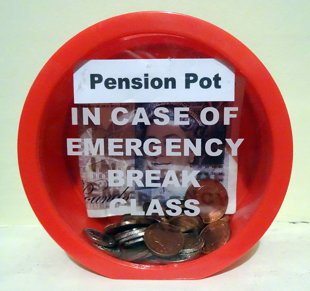
 But while we can look forward to longer life, for the government, it presents some challenges The first is that we just don’t save enough for our old age. This seems to be partly because we find it hard to make decisions that will have an impact so far in the future. There are a number of measures that have been put in place to encourage us to save more, including auto-enrolment into company pension schemes. This is being rolled out across businesses over the next three years. In the 2014 Budget, the Chancellor announced that people reaching retirement age will be able to draw all their pension as a cash lump sum, rather than having to take it as a regular income.
Another concern for government is the variations that we find in life expectancy across the UK. The 2014 ONS data identified that life expectancy for men born in Glasgow in 2012 is 72.6, in East Dorset it is 82.9. 25% of those in Glasgow are not expected to live to 65. The gap in years of good health is even greater. This presents governments with a long-term problem. How do they achieve greater equality in this instance? Do they focus resources on the areas that need it most? Do they legislate to address behaviour? Or do they rely on the provision of good advice – on diet, exercise and other factors?
Information has a role to play in both areas identified above. In April 2014, Steve Webb, suggested that in order to make good decisions at the point of retirement, people need to understand more about what lies ahead. He said:
People tend to underestimate how long they’re likely to live, so we’re talking about averages, something very broad-brush. Based on your gender, based on your age, perhaps asking one or two basic questions, like whether you’ve smoked or not, you can tell somebody that they might, on average, live for another 20 years or so.
This suggestion has led to some concerns being expressed at what appears to be an over-simplistic approach. Estimates can only be based on a mix of averages modified by individual information. Would the projections be shared with pension providers? What would you do if you exceeded your forecast life expectancy – by a long way – and had spent all your money? Could you sue someone?
Will your pension pot last as long as you will? The Telegraph, Dan Hyde and Richard Dyson (23/4/2014)
Scientists invent death test that will tell us how long we have to live Metro (11/8/13)
Games host Glasgow has worst life expectancy in the UK The Guardian, Caroline Davies (16/4/2014)
Pensioners could get life expectancy guidance BBC News Politics (17/4/14)
ONS reveals gaps in life expectancy across the UK FT Adviser Pensions, Kevin White (23/4/14)
Health care aid for developing countries boosts life expectancy Health Canal, Ruth Ann Richter (22/4/14)
A third of babies born this year will live to 100 This is Money.co.uk, Adam Uren (11/12/13)
Questions
- Thinking about the UK, what are the factors that might explain variations in life expectancy across different regions? How might the government address these differences? Why would they want to do so?
- Do the same factors explain variations between countries? Who can address these differences? Who would want to do so?
- If you could have a reasonable prediction of your life expectancy at 65, would you want it? How would your behaviour change if you were predicted a longer than average life expectancy? How would it change if you were predicted a shorter than average life expectancy?
- If you could have an accurate prediction of your life expectancy at 18, how would your answers differ? If this were possible, would it present any problems?
 The UK Shadow Chancellor, Ed Balls, has announced that, if Labour is returned to power in the next election, it will bring back the 50% top rate of income tax (see also). This will apply to incomes over £150,000.
But will this raise more tax revenue? The question here concerns incentive effects. Will the higher rate of income tax discourage work by those earning £150,000 or encourage tax avoidance or tax evasion, so that the total tax take is reduced? The Conservatives say the answer is yes. The Labour party says no, claiming that there will still be an increase in tax revenue.
 The possible effects are summed up in the Laffer curve (see The 50p income tax rate and the Laffer curve). As the previous post stated:
These arguments were put forward in the 1980s by Art Laffer, an adviser to President Reagan. His famous ‘Laffer curve’ (see Economics (8th edition) Box 10.3) illustrated that tax revenues are maximised at a particular tax rate. The idea behind the Laffer curve is very simple. At a tax rate of 0%, tax revenue will be zero – but so too at a rate of 100%, since no-one would work if they had to pay all their income in taxes. As the tax rate rises from 0%, so tax revenue would rise. And so too, as the tax rate falls from 100%, the tax rate would rise. It follows that there will be some tax rate between 0% and 100% that maximises tax revenue.
As Labour is claiming that re-introducing the 50% top rate of income tax will increase tax revenue, the implication is that the economy is to the left of the top of the Laffer curve: that, at current level of income, the curve is still rising.
Work by HMRC, and published in the document The Exchequer effect of the 50 per cent additional rate of income tax, suggested that the previous cut in the top rate from 50% to 45% would cut revenue by around £3.5 billion if there were no incentive effect, but with the extra work that would be generated, the cut would be a mere £100 million. This implies, other things being equal, that a rise in the rate from 45% to 50% would raise only a tiny bit of extra taxes.
However, the HMRC analysis has been criticised and especially its assumptions about the incentive effects on work. Then there is the question of whether a rise in the rate from 45% to 50% would have exactly the reverse effect of a cut from 50% to 45%. And then there is the question of how much HMRC could reduce tax evasion and avoidance.
The following article from the Institute for Fiscal Studies examines the effects. However, the authors conclude that:
… at the moment, the best evidence we have still suggests that raising the top rate of tax would raise little revenue and make, at best, a marginal contribution to reducing the budget deficit an incoming government would face after the next election.
But there is also the question of equity. Putting aside the question of how much revenue would be raised, is it fair to raise the top rate of tax for those on high incomes? Would it make an important contribution to reducing inequality? This normative question lies at the heart of the different views of the world between left and right and is not a question that can be answered by economic analysis.
Article
50p tax – strolling across the summit of the Laffer curve? Institute for Fiscal Studies, Paul Johnson and David Phillips (Jan 2014)
Questions
- Distinguish between tax evasion and tax avoidance.
- How would it be possible for a rise in tax rates to generated less tax revenue?
- Could policies shift the Laffer curve as opposed to merely resulting in a move along the curve?
- What is meant by ‘taxable income elasticity (TIE)’? What are its determinants?
- Is the taxable income elasticity at the top of the Laffer curve equal to, above or below zero? Explain.
- Why did the Office for Budget Responsibility chairman, Robert Chote, conclude that, whatever the precise answer, we were ‘strolling across the summit of the Laffer curve’?
- Explain why ‘there is little additional evidence to suggest that a 50p rate would raise more than was estimated by HMRC back in 2012’.
- What contribution can economists make to the debate on the desirability of reducing inequality?
 GDP is still the most frequently used indicator of a country’s development. When governments target economic growth as a key goal, it is growth in GDP to which they are referring. And they often make the assumption that growth in GDP is a proxy for growth in well-being. But is it time to leave GDP behind as the main indicator of national economic success? This is the question posed in the first of the linked articles below, from the prestigious science journal Nature.
As the article states:
Robert F. Kennedy once said that a country’s gross domestic product (GDP) measures “everything except that which makes life worthwhile”. The metric was developed in the 1930s and 1940s amid the upheaval of the Great Depression and global war. Even before the United Nations began requiring countries to collect data to report national GDP, Simon Kuznets, the metric’s chief architect, had warned against equating its growth with well-being.
GDP measures mainly market transactions. It ignores social costs, environmental impacts and income inequality. If a business used GDP-style accounting, it would aim to maximize gross revenue — even at the expense of profitability, efficiency, sustainability or flexibility. That is hardly smart or sustainable (think Enron). Yet since the end of the Second World War, promoting GDP growth has remained the primary national policy goal in almost every country
So what could replace GDP, or be considered alongside GDP? Should we try to measure happiness? After all, behavioural scientists are getting much better at  understanding and measuring the psychology of human well-being (see the blog posts Money can’t buy me love and Happiness economics).
Or should we focus primarily on long-term issues of the sustainability of development? Or should we focus more on the distribution of income or well-being in a world that is becoming increasingly unequal?
Or should measures of well-being involve weighted composite indices involving things such as life-expectancy, education, housing, democratic engagement, leisure time, social mobility, etc. And, if so, how should the weightings of the different indicators be determined? The United Nations Development Programme (UNDP) produces annual Human Development Reports, where countries are ranked according to a Human Development Index. As the UNDP site states:
The breakthrough for the HDI was the creation of a single statistic which was to serve as a frame of reference for both social and economic development. The HDI sets a minimum and a maximum for each dimension, called goalposts, and then shows where each country stands in relation to these goalposts, expressed as a value between 0 and 1.
HDI is a composite of three sets of indicators: education, life expectancy and income (see). The UNDP since 2010 has also produced an Inequality-adjusted HDI (IHDI).
The IHDI will be equal to the HDI value when there is no inequality, but falls below the HDI value as inequality rises. The difference between the HDI and the IHDI represents the ‘loss’ in potential human development due to inequality and can be expressed as a percentage.
You can now build your own HDI for each country on the UNDP site by selecting from the following indicators: health, education, income, inequality, poverty and gender.
The Nature article considers a number of measures of progress and considers their relative merits. The other articles also look at measuring national progress and well-being and at the relationship between income per head and happiness. It is clear that focusing on GDP alone provides too simplistic an approach to measuring development.
Development: Time to leave GDP behind Nature, Robert Costanza, Ida Kubiszewski, Enrico Giovannini, Hunter Lovins, Jacqueline McGlade, Kate E. Pickett, Kristín Vala Ragnarsdóttir, Debra Roberts, Roberto De Vogli and Richard Wilkinson (15/1/14)
The happiness agenda makes for miserable policy The Conversation, Daniel Sage (9/1/14)
Economic view: No matter what the politicians say, GDP is a distorted guide to economic performance and a bad way to measure prosperity Independent, Guy Hands (28/1/14)
Buy buy love The Economist (22/6/13)
Experts confirm that money does buy happiness – but only up to £22,100 Independent, Jamie Merrill (28/11/13)
Can Money Buy Happiness? Scientific American, Sonja Lyubomirsky (10/8/10)
Money can buy happiness The Economist (2/5/13)
Money can buy happiness Hacker News, pyduan (13/1/14)
Can ‘happiness economics’ provide a new framework for development? The Guardian, Christian Kroll (3/9/13)
The 10 Things Economics Can Tell Us About Happiness The Atlantic, Derek Thompson (31/5/12)
Financial crisis hits happiness levels BBC News (3/11/13)
Happiness study finds that UK is passing point of peak life satisfaction The Guardian, Larry Elliott (27/11/13)
How GDP became the figure everyone wanted to watch BBC News, Peter Day (16/4/14)
Economic development can only buy happiness up to a ‘sweet spot’ of $36,000 GDP per person Science Daily (27/11/13)
Questions
- What does GDP measure?
- How suitable a measure of economic progress is growth in GDP?
- How can GDP be adjusted to make it a more suitable measure of economic progress?
- What are the advantages of using composite indicators of well-being?
- What difficulties are there in measuring well-being using composite indicators?
- Assuming there were no measurement problems, what indicators would you include in devising the optimum composite indicator of well-being?
- Can money buy happiness?
- Why do life satisfaction levels peak at around $36,000 (adjusted for Purchasing Power Parity (PPP))?
 The ONS has just released its annual publication, The Effects of Taxes and Benefits on Household Income. The report gives data for the financial year 2012/13 and historical data from 1977 to 2012/13.